I'm sorry... this might be a semi-long blog... I apologize ahead of time...
When I first started this project I honestly had no idea what I was getting into. It sounded simple enough... I mean this is what I do right?!? No one knows my style better than I do so it was going to be a simple, easy peasy "challenge". Ha!
My intention from the beginning was to create a comfortable, yet stylish sitting room. The ONLY thing I kept from my previous room was 1 lamp (an obligatory thing)... I knew that I wanted to mix metals and I knew that I wanted texture... I bought my "staple" pieces (the loveseats, chairs & art) but made sure that everything else could be "replaced" without upsetting the balance. With the pieces I chose, I could easily switch out side tables, throw pillows and decor.
I wanted to keep the room simple and easy. Clutter and unnecessary pieces BE GONE! One thing I always tell my clients... (well there's 2 actually)
1. Just because there is space in a room does not mean something has to go there.
2. Please, don't line every piece of furniture up against a wall if you don't have to.
Ohhh... the art <3 ... The canvas I chose was from an incredible artist out of New Jersey. Her work is brilliant. You can follow her on instagram here. I was amazed by all the talent I found along this short 6 week journey.
Three things I made sure to do and remember throughout this challenge.
1. Always, always read reviews
2. Measure and mark... I used tape on the floor to measure the size of the loveseats, chairs, rugs... pretty much everything before I ordered it.
3. "Details are not the details, they make the design" -Charles Eames
I will be making an in depth post about the items I used in my room next week, but feel free to contact me with any questions!
Let's take a quick look at the "before"...
 |
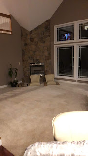
Sad, I know. Even the poor plant was depressed. I still love the sofa and chair, but it was time for a change. Anyway...
Here are the completed ORC photos <3
My photographer is awesome. Not only was she understanding when I had to reschedule the 1st shoot (I was stuck waiting on a package), but she took these photos & edited them in time for this... Thank You Liz! You can check out her website here.
I love how this room turned out. It's much more open, therefore making it appear larger in size. The conversation area is clearly defined... and I stuck with the color blue which I love. Thank you to all who have followed along on this fun and exciting transformation. I appreciate you!
Chicly Yours,
Nikole


